Business Intelligence 2 min read
Making healthcare waitlist pressure visible
A dashboard case study that compares backlog and service bottlenecks.
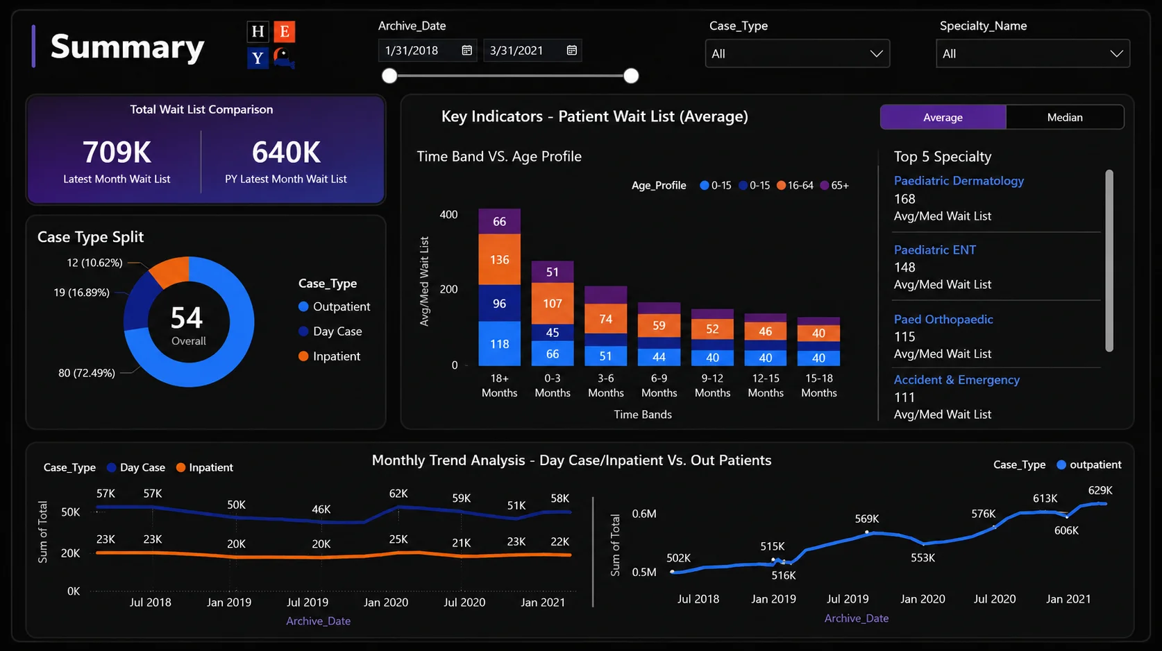
The Healthcare Operations Dashboard case study starts with a practical question: where is the waitlist becoming harder to manage? Its public design notes describe specialty comparisons, backlog trends, Power Query preparation, and a star-schema approach to reporting.
A dashboard screenshot is available in the repository. The source data and report file are not published, so the public case study documents the analytical structure and intended views rather than a reproducible live dashboard.